Penguin Project
During my final year studying BA(Hons) Graphic Design we were posed a challenge for three weeks out of a module. It involved running a competition from Penguin Books from 2024. We had a selection of three books: The Chimp Paradox: the Mind Management Programme for Confidence, Success and Happiness, The Wind in the Willows, and The Strange Case of Doctor Jekyll & Mister Hyde.
I chose the latter, but I was sick for two of the three weeks. It meant working at my lowest energy, but that gave me an excuse to recline and read the book to take notes on themes, imagery, and visual metaphors by Robert Louis Stevenson.


Three which stood out to me for their striking design choices required further exploration - semiotics, colour theory, and typography all included. Although they were fantastic examples of the book's cover art, the themes in them weren't unique. My goal of a truly unique cover art design would be difficult with such a plethora of prior prints. This didn't mean I had to avoid the themes altogether though. They had been published for a reason, so I sought to find it.


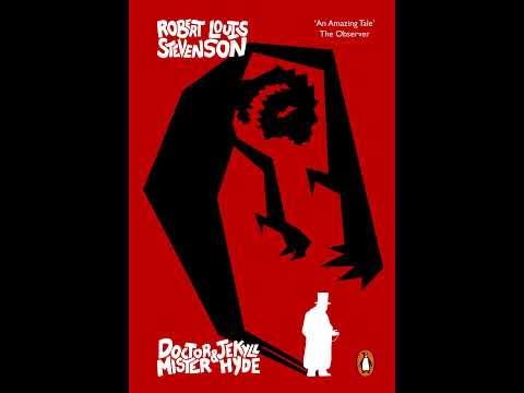
Exploring the writing about Jekyll and Hyde, Stevenson explains that Hyde was a diminutive size, with rough and heavy hands. Otherwise the only description of Hyde was an unsettling gaze. It reminded me of similar descriptions from survivors of serial killers. In researching this, as well as remarkable hands documented across the world, I found some parallels and began sketching them out making use of anatomical images.
I enjoyed the duality of the soft hands of a doctor, and the rough hands of a hedonistic murderer. The redemptive ending felt like the doctor's hand lifting up the rugged Hyde's would make a great start to a design idea.


Peer and academic feedback led me to keep the colour palette and apply it to a new visual metaphor. I worked with the idea of vapour in a glass flask. The typography doubled as vapour in the art, with a secondary style of type for the rubber bung.


In feedback, the typography in its bung was praised, and a previous idea from early sketches was picked out as a potential place to begin the next stages. The vapour in the flask was seen as too involved of a visual metaphor for anyone who was unfamiliar with the story.


The goal was complete - make a truly unique design. This wasn't enough for me though. I needed to go the extra mile to get that wow factor, and it fell as an animation intended to sit alongside a book shop's point of sale. The potential to double as a social media advert / stinger gave it extra value to the project.
All in all, I'm very proud of this design. It took a long road in only three weeks, and I created three finished designs in that time - and all while laid low from illness. In a live competition, I have faith this would do well. I'm excited to enter one in the future, given the opportunity.